


Colour expert, Lee Eiseman shared her insights on Pantone View Home + Interiors 2025 forecast at the show this week.
Colour expert Leatrice (Lee) Eiseman explained to The Inspired Home Show 2024 attendees this week the reasons why ‘A New Harmony’ was selected as the theme to represent the seven colour palettes in the Pantone View Home + Interiors 2025 forecast.
Lee is a colour specialist whose expertise is recognised worldwide as the executive director of the Pantone Color Institute and director of the Eiseman Center for Color Information and Training.
“Harmony is a beautiful word that conjures up certain pictures in your mind…being in tune with ourselves and with others within our immediate surroundings and the greater world around us. It also conveys a sense of balance, a sense of equilibrium and a much sought-after need and aspiration of humans,” said Lee. “When it comes to design, much of the harmony that is created is certainly because of the educated and creative use of colour.”
Lee shared that the inspiration for the 2025 palettes came from a variety of sources and industries, but nature played a significant role. That’s largely due to the beauty in nature and people’s desire to be “thoughtful, congruent and compatible with the earth we inhabit,” she said.
The variety of colours that come from within the earth can be both muted and vibrant, and can be reflected in anything from chillable whiskey rocks made from natural soapstone to vibrant glassware reminiscent of amethyst gems. Animals, flowers and plants can all be natural sources of color inspiration, said Lee, noting that the colour green is trending particularly in specialty beverages.
When it comes to consumers’ desire for balance and wellness, Lee noted the current popularity of comfort foods, weighted blankets and dance as a form of both exercise and creative expression.
Movies continue to be an important influence on colour trends, especially now they have more staying power due to streaming, said Lee. ‘Asteroid City’ – set in a desert town in the 1950s – brings a lot of retro pastels back into play, while the new Batman movie due out in 2025 will bring in murky, dark colours. Both the Toy Story and Smurfs sequels will bring a variety of fun, bright colours next year.
Other influences Lee noted include: the popularity of western motifs including denim and leather; how art is being influenced by both AI and regenerative design; unique and original fashion; and surrealism in both art and advertising.
That doesn’t mean there isn’t a place for neutrals, Lee explained. Designers and marketers just need to add a touch of newness so the eye doesn’t gloss over them, adding that she currently loves the use of “off-white and cream alongside what we’re calling punked up pastels.”
That served as a segway for Pantone’s Color of the Year 2024 – Peach Fuzz. This nurturing peach tone is a versatile hue, which Lee described as “much more versatile than you might think.” It also brings an element of tactility, which makes it more desirable by appealing to the senses of touch and sight.
“Peach Fuzz encourages you to ‘reach out and touch,’” said Lee. “Even if it’s just to give yourself a few moments of peace…It means making room for yourself, to be yourself, to heal and to flourish in all of its softness.”
Lee closed her presentation by explaining each of the seven palettes in the Pantone View Home + Interiors 2025 forecast. Because harmony is commonly associated with music, each of the seven palettes has a musical name. As explained in the Pantone Color Watch display, just as different people have different tastes in music, they also have different tastes in color…so there is a palette for everyone.
- Blended Notes – Described by Lee as “healthful and tranquil,” this palette features cool naturals, icy tones and refreshing blue-greens. It’s gently stimulating, like a breath of fresh air.
- Easy Listening – “This palette is all about serenity,” said Lee. “It says ‘Let’s relax. Let’s unwind.” It features a variety of soft and light-hearted pastels “with a gentle fizz.”
- Tempo Timing – Inspired by kinetic energy and youthful athleticism, this palette is polished and crafted. Dark conveys a sense of power, Lee explained, so this palette includes several dark tones. But it also contains a few lighter ones like off-white and peach so it’s not too dark.
- Staccato – In what Lee called a “different kind of mix,” Staccato can be described as representing “sweet and sour.” It incorporates bright colors that can be used in colour blocking, and evokes feelings of design as play.
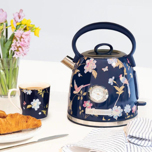
- Stage Prescence – Retro 1970s stylings and smooth jazz are influences in this earthy and eclectic palette that can easily be used in bold patterning. It features strong colours like tan with a little orange in it, but it’s still smooth, said Lee.
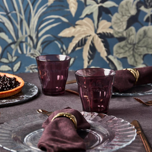
- Perfect Pitch – Some might call this palette “gothic” Lee said, but she described it as “smokey and high-brow with colors that appear to have a powdery finish.” It feels cinematic and mysterious, while conveying a feeling of sophistication and luxury.
- Crescendo – Like its name conveys, Crescendo includes colours that seems to make noise. Though Lee called it “not quite as bold as Staccato,” this palette also features vibrant tones that seem to build toward a joyful journey. It has influences in both technology and music.
An audio recording of the program will be posted on the Inspired Home Show’s website at TheInspiredHomeShow.com/education/#keynotes.